



What does your website look like on a Nokia G22 in Lagos, a Samsung Galaxy A15 in Manila, or an ageing iPhone SE in São Paulo? If you cannot answer that question with confidence, your front-end stack may be working against you. More than 60% of global web traffic now comes from mobile devices, and in Africa and South Asia, that figure consistently crosses 75%. Building desktop-first and hoping mobile “sorts itself out” is a strategy from a decade you should have left behind.
The good news: 2026 has handed developers an extraordinary toolkit. Whether you are building a SaaS dashboard, a media publication, an e-commerce storefront, or a hybrid mobile app, there is a purpose-built, battle-tested framework sitting at the exact intersection of your performance requirements and your team’s skill set. The challenge is no longer finding a solution. It is cutting through the noise to find the right one.
This guide maps every major mobile-first front-end framework and component library that deserves your attention this year. You will learn what each tool does, who it is built for, where it excels, and where it shows its limits. By the time you finish reading, you will have a clear framework for a selection process and a shortlist ready to match your next project.
Table of Contents
Disclosure: Our content is engineered to help you make informed, data-driven, and smart decisions. Digital Solutions Edge is reader-supported; when you engage with our recommendations or click certain links, we may receive a commission. This support allows us to continue delivering the digital solutions you rely on. Thank you for being part of our community.
Why Mobile-First Still Matters in 2026
Mobile-first goes beyond a design preference. It is a performance philosophy and, increasingly, a business imperative. Google’s mobile-first indexing policy, which became the default for all new websites as far back as 2020, means your site’s mobile rendering is the version the search engine uses to evaluate, rank, and index your content. A desktop-polished website with a broken mobile layout is not just a bad experience. It is a ranking liability.
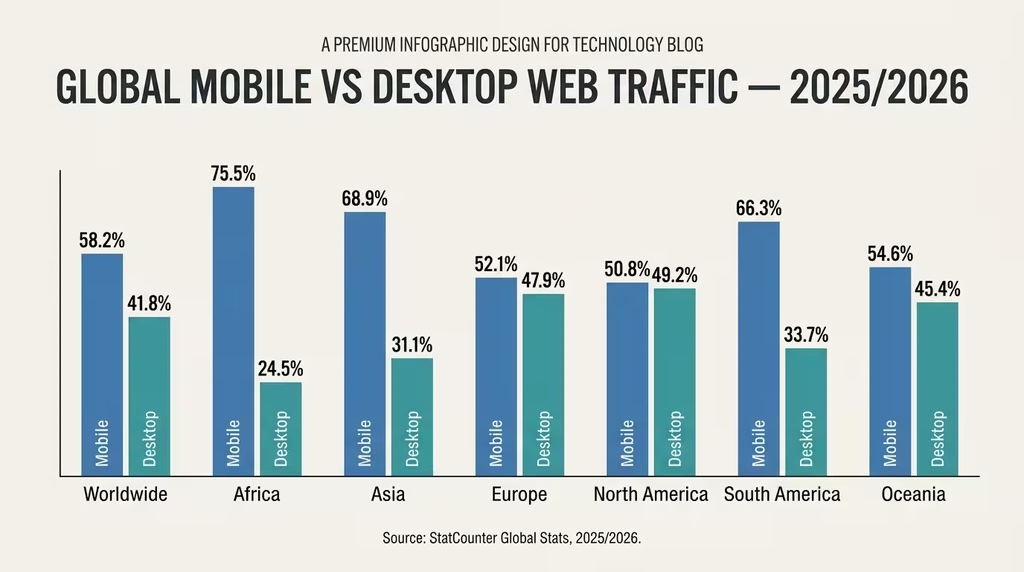
The economics are equally clear. Page load speed on mobile directly affects conversion rates. According to data from Google’s Think with Google research platform, a one-second delay in mobile page load time can reduce conversions by up to 20%. For e-commerce businesses and SaaS products targeting emerging markets, where bandwidth is often constrained, the performance gap between a well-optimised mobile-first build and a retrofitted desktop site can represent real, measurable revenue loss.
The mobile-first principle is also a forcing function for better architecture. When you design for the smallest, most constrained context first, you are forced to prioritise only what is essential. The result is leaner code, faster loads, and a more focused user experience that scales gracefully to larger screens. That discipline benefits every device, not just mobile.
How to Choose a Front-End Framework: The FACCT Decision Filter
Before diving into individual tools, let us establish a decision framework, so your final choice is based on project fit rather than hype. The FACCT filter gives you five criteria to weigh for every candidate framework.
F – Fit for Project Type: Is the framework designed for your category of application? A content-heavy editorial site has very different needs from a real-time collaborative SaaS tool or an enterprise mobile app.
A – Accessibility and Standards Compliance: Does the framework build to WCAG accessibility standards by default? ARIA compliance is becoming a legal requirement in many jurisdictions, and it is a marker of framework maturity.
C – Community and Ecosystem: A framework with an active community means better documentation, faster bug fixes, more third-party plugins, and a larger hiring pool. Community size is a proxy for longevity.
C – Customisation Depth: Some frameworks are highly opinionated and fast to spin up. Others give you total control at the cost of configuration time. Your team’s capacity and project timeline will determine which trade-off is acceptable.
T – Technical Performance on Mobile, specifically: bundle size, time to first byte (TTFB), Largest Contentful Paint (LCP), and Cumulative Layout Shift (CLS). These are not optional considerations. They are Core Web Vitals that Google uses to rank your content.
Use these five lenses throughout this guide as you assess each option.
Core Mobile-First Application Frameworks
These frameworks provide the foundational architecture for building complete, interactive, high-performance applications. They determine how your app is structured, rendered, and delivered to the browser or device.
1. React
Best for: Interactive web applications, dashboards, SaaS products, content platforms
React remains the most widely adopted JavaScript library for building user interfaces, and its dominance in 2026 shows no signs of loosening. Meta-maintained and community-driven, React operates on a component model where UI is broken into reusable, self-contained building blocks. Its virtual DOM implementation allows the framework to update only the parts of a page that change, which translates to efficient re-rendering on resource-constrained mobile devices.
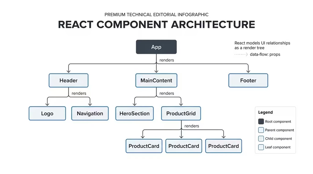
The ecosystem around React is its greatest asset. React Router handles navigation, React Query manages server state, and Zustand or Redux handles global application state. Most critically for mobile-first developers, React Server Components (RSC) in Next.js allow you to shift heavy rendering work to the server, reducing the JavaScript payload that reaches the client’s mobile browser. This alone makes React-powered Next.js applications significantly more performant on low-bandwidth mobile connections.
For native mobile applications, React Native extends the same component paradigm to Android and iOS, sharing a large portion of logic between web and app builds. The Expo framework further reduces the friction of React Native development, making it a natural fit for teams building cross-platform products.
- Bundle size: Moderate (minified React core ~40KB)
- Learning curve: Moderate, but enormous availability of resources
- Mobile performance ceiling: Very high, especially with Next.js RSC and Suspense
Limitation to note: React by itself is a library, not a full framework. You will need to assemble your own routing, data-fetching, and server-rendering setup unless you build on Next.js or Remix.
2. Flutter
Best for: Cross-platform native apps (Android, iOS, web), pixel-perfect branded UIs
Flutter, Google’s cross-platform UI toolkit, uses the Dart programming language to compile to native ARM code for Android and iOS, and to WebAssembly for web deployments. Unlike React Native, which bridges to native UI components, Flutter renders every pixel itself using its own Skia or Impeller graphics engine. The result is an identical, high-fidelity UI across every platform with no discrepancy between how a button looks on Android versus iOS.
For mobile-first front-end developers, Flutter’s design system is intentionally adaptive. Widgets like Scaffold, AppBar, and BottomNavigationBar follow platform conventions by default, while still allowing deep customisation. Flutter’s built-in responsiveness support through MediaQuery, LayoutBuilder, and Flexible/Expanded widgets gives you fine-grained control over how your layout adjusts at different screen sizes.
Flutter’s web output has matured considerably. While it is not the right choice for SEO-sensitive content sites (the HTML renderer creates accessibility challenges), it excels for web apps that prioritise a consistent, near-native experience: think internal tools, enterprise dashboards, and branded consumer apps.
- Languages required: Dart (distinct from JavaScript; has a learning curve)
- Bundle size: Larger initial footprint than pure-web frameworks
- Mobile performance ceiling: Exceptionally high for native app feel
Limitation to note: Dart is not a language most web developers already know, and Flutter web is not suitable for text-heavy, SEO-dependent sites.
Flutter Official Documentation
3. Svelte
Best for: Performance-critical web apps, progressive enhancement projects, teams prioritising lean builds
Svelte’s architecture is fundamentally different from React or Vue. Rather than shipping a virtual DOM runtime to the browser, Svelte compiles your components into highly optimised, imperative JavaScript at build time. There is no framework overhead at runtime. The browser simply executes lean, plain JavaScript that directly manipulates the DOM.
For mobile-first development, this compilation approach produces some of the smallest bundle sizes in the ecosystem. A typical Svelte app ships a fraction of the JavaScript that an equivalent React app would require, and that directly maps to faster parse times, shorter time to interactive (TTI), and better performance on entry-level Android devices that are common in high-growth markets.
SvelteKit, the full-stack companion framework for Svelte, handles routing, server-side rendering, and static site generation. It is arguably the most ergonomic full-stack framework available to front-end developers today, offering Next.js-comparable capability with considerably less boilerplate.
- Bundle size: Exceptionally small
- Learning curve: Low to moderate; the syntax is close to standard HTML
- Mobile performance ceiling: Among the highest available
Limitation to note: Svelte’s ecosystem is smaller than React’s. Finding third-party component libraries, hiring Svelte developers, or accessing enterprise-grade plugins is more limited.
4. Ionic Framework
Best for: Web developers building hybrid mobile apps using HTML, CSS, and JavaScript
Ionic occupies a specific and valuable niche. It is the go-to choice for web developers who need to ship a mobile app without learning native Android or iOS development. Built on standard web technologies, Ionic wraps your web app in a native shell using Capacitor (its modern replacement for Cordova), providing access to device APIs like the camera, GPS, and push notifications.
Ionic ships with over 100 mobile-optimised UI components that automatically adapt their appearance to match iOS or Android platform conventions. A single <ion-card> component, for example, renders with iOS styling on an iPhone and Material Design styling on an Android device, reducing the need for platform-specific design work.
The framework is officially framework-agnostic in 2026. You can use Ionic with React, Vue, Angular, or plain JavaScript. This flexibility, combined with its deep mobile component library, makes it the most complete hybrid development solution for web-native teams.
- Bundle size: Moderate to large (Capacitor adds overhead)
- Learning curve: Low for developers with HTML/CSS/JS experience
- Mobile performance ceiling: Good for business apps; not ideal for graphics-intensive applications
5. Qwik
Best for: Marketing sites, e-commerce, and any project where initial load speed is a critical business metric
Qwik introduces a concept called “resumability” to front-end architecture. Traditional frameworks like React hydrate the entire application in the browser on load, downloading and executing all JavaScript before the page becomes interactive. Qwik serialises application state on the server and sends a minimal startup script to the browser. Interactivity is lazy-loaded on demand, at the component level, exactly when a user triggers it.
The practical result is near-instant First Input Delay (FID) and Time to Interactive (TTI) regardless of application complexity. For users on 3G or 4G mobile connections common in Africa, Southeast Asia, and Latin America, Qwik-built pages feel immediate in a way that hydration-heavy frameworks simply cannot match.
Qwik City, the meta-framework that pairs with Qwik, handles routing, data loading, and server-side rendering in a way that feels familiar to Next.js developers. The learning curve is real but manageable, and the performance payoff for mobile-first, SEO-critical projects is substantial.
- Bundle size: Extremely small initial payload
- Learning curve: Moderate to steep; paradigm shift required
- Mobile performance ceiling: Best-in-class for initial load performance
6. Astro
Best for: Content-heavy sites – blogs, documentation, editorial publications, marketing pages
Astro is built around a radical performance principle: ship zero JavaScript by default. Every Astro page renders to static HTML on the server unless you explicitly opt a component in to client-side interactivity. This “islands architecture” allows you to embed interactive React, Vue, Svelte, or Solid components precisely where you need them, while the rest of the page remains static HTML.
For mobile users on limited data plans, an Astro-built blog or documentation site loads with the speed of a static HTML file. The absence of framework JavaScript on non-interactive pages removes kilobytes of overhead that would otherwise block rendering on a mobile browser. Astro consistently achieves near-perfect Lighthouse scores on mobile, which has practical consequences for both user experience and search rankings.
Astro’s content collections feature and deep Markdown/MDX support make it the strongest framework available for developer documentation, technical blogs, and editorial content in 2026.
- Bundle size: Near zero on static pages
- Learning curve: Low for developers with HTML/component experience
- Mobile performance ceiling: Best-in-class for content sites
Limitation to note: Astro is not appropriate for highly dynamic applications with significant client-side interactivity needs. Use it for content, not complex app UIs.
Utility and CSS Frameworks
CSS frameworks provide the styling layer for mobile-first layouts. They do not determine how your application handles data or routing, but they govern how your interface looks and responds across screen sizes.
7. Tailwind CSS
Best for: Teams wanting complete design control with utility-first speed, custom design systems
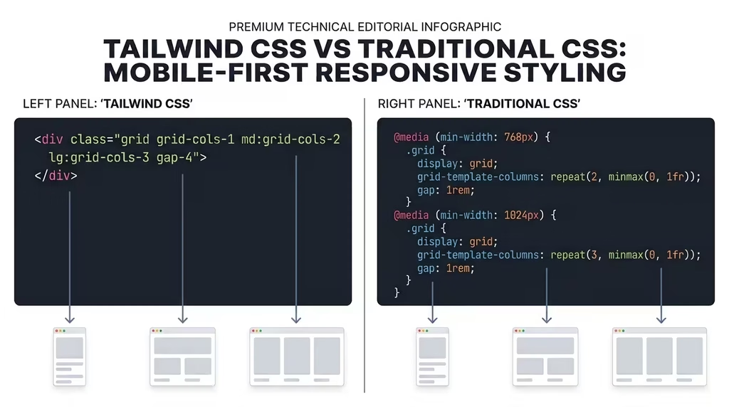
Tailwind CSS is the fastest-growing CSS framework in the ecosystem, and for a clear reason. Instead of pre-styled components, Tailwind provides low-level utility classes that you compose directly in your HTML. Want a responsive padding? Add px-4 md:px-8 lg:px-16. Want a flex container that stacks vertically on mobile and horizontally on desktop? Write flex flex-col md:flex-row.
The mobile-first breakpoint system is baked into Tailwind’s core. Every utility class applies to all screen sizes by default. To scope a style to a specific screen size, you prefix it with a breakpoint: sm:, md:, lg:, xl:, or 2xl:. This enforces mobile-first thinking at the code level, making it structurally difficult to write desktop-first styles by accident.
Tailwind v4, which became stable in 2025, introduced a complete rewrite using CSS variables and native cascade layers, removing the dependency on PostCSS and reducing configuration overhead significantly. Build times are faster, and the framework produces smaller CSS outputs through its content-scanning purge system.
- Bundle size: Minimal (only includes classes actually used)
- Learning curve: Moderate; requires memorising or looking up class names initially
- Design constraint: No pre-built components; you assemble everything yourself
8. Bootstrap
Best for: Rapid prototyping, teams needing a complete, battle-tested component set, projects with mixed developer seniority
Bootstrap is the framework that popularised mobile-first design at scale. Since Twitter open-sourced it in 2011, it has grown to power more than 26% of the top websites globally and accumulated over 600 million downloads. In 2026, Bootstrap 5 remains the industry standard for teams that need a reliable, comprehensive starting point without building a design system from scratch.
The 12-column responsive grid is Bootstrap’s most iconic feature. Built on CSS Flexbox, it allows complex multi-column layouts to collapse gracefully across six breakpoint tiers: xs, sm, md, lg, xl, and xxl. Combine this with Bootstrap’s ready-made components – navbars, modals, cards, forms, carousels, alerts, and more – and you can prototype a professional-looking mobile-first interface in hours rather than days.
Bootstrap 5 removed the jQuery dependency entirely, running on lightweight native JavaScript plugins. The framework also ships with a comprehensive Sass variable system that makes theming and brand customisation clean and maintainable without hacking core CSS.
For teams with developers across different experience levels, Bootstrap’s predictability is a feature. Senior developers do not need to re-explain layout conventions. Junior developers can ship responsive markup on day one. That consistency has real value on collaborative projects.
- Bundle size: Moderate (~22KB CSS, ~16KB JS minified and gzipped)
- Learning curve: Low; arguably the most documented framework in existence
- Design constraint: Generic “Bootstrap look” requires deliberate overriding for branded projects
Bootstrap Official Documentation
9. Foundation
Best for: Enterprise projects requiring advanced accessibility, high customisation, and long-term maintainability
Foundation by ZURB is Bootstrap’s closest peer in completeness, but its design philosophy is more enterprise-oriented. Where Bootstrap leans toward approachability, Foundation leans toward power and precision. It ships with two distinct flavours: Foundation for Sites (web) and Foundation for Emails (responsive HTML email, which remains notoriously difficult to do well).
Foundation’s grid system offers both a Flexbox grid and an XY Grid that handles horizontal and vertical alignment with equal precision. Its accessibility features go deeper than most frameworks, with built-in ARIA roles and keyboard navigation patterns across all interactive components. For projects serving government, healthcare, or any accessibility-regulated industry, Foundation’s commitment to standards is genuinely valuable.
The framework is highly modular. You can include only the components your project needs, keeping the CSS footprint lean. Foundation’s Sass architecture also allows deeper source-level customisation than Bootstrap’s variable system.
- Bundle size: Configurable; can be made very lean
- Learning curve: Moderate to steep; rewards developers who invest in learning it
- Ecosystem size: Smaller community than Bootstrap or Tailwind
10. Bulma
Best for: Developers who want modern Flexbox-based layouts without JavaScript, rapid UI scaffolding
Bulma is a CSS-only framework, which is both its clearest selling point and its primary limitation. There is no JavaScript at all in Bulma. Every component is styled purely with CSS, making it exceptionally portable. You can drop Bulma into any project, regardless of JavaScript framework, without compatibility concerns.
The framework is built entirely on Flexbox and is genuinely mobile-first. Its column system uses the .columns and .column classes with responsive modifiers that work reliably across devices. Bulma’s syntax is clean and readable, and the component set covers the essentials: navbar, card, buttons, forms, modals, tabs, and more.
The absence of JavaScript means interactive components like modals and dropdowns require you to wire up behaviour yourself or add a small companion library. For developers comfortable with that trade-off, Bulma is one of the most elegant CSS-only frameworks available.
- Bundle size: Small (~31KB CSS minified)
- Learning curve: Low; clean, semantic class names
- JavaScript support: None built-in; wire your own or pair with Alpine.js
Component Libraries
Component libraries sit on top of CSS frameworks or application frameworks to provide pre-built, accessible UI elements. Many are React-specific. All of those below are mobile-first by design.
11. Mantine
Best for: Full-featured React apps needing a comprehensive component set with strong defaults and hooks
Mantine has emerged as one of the most complete React component libraries available in 2026, shipping over 100 fully responsive components alongside more than 50 utility hooks. What sets Mantine apart is the depth of its supporting infrastructure. Beyond standard UI components, it provides a rich suite of hooks for form management, clipboard access, media queries, scroll handling, and mobile gesture detection.
The form management system in Mantine is notably powerful, handling validation, error states, and submission logic with a clean API that removes the need for external form libraries on most projects. Every component in Mantine is fully responsive and renders correctly across all breakpoints by default, which reduces the custom CSS you need to write for mobile layouts.
Mantine v7 introduced a complete CSS Modules approach, removing the runtime CSS-in-JS dependency that contributed to slower mobile hydration in earlier versions. The performance improvement on mobile devices is significant.
- Bundle size: Modular; import only what you use
- Learning curve: Moderate; documentation is thorough
- Best pairing: Next.js or SvelteKit with React adapters
12. Chakra UI
Best for: Accessibility-first React projects, design systems with strong token foundations
Chakra UI’s design philosophy centres on accessibility and developer ergonomics. Every component ships with ARIA attributes configured correctly by default, passing WCAG 2.1 AA compliance checks without additional configuration. For projects where accessibility is a regulatory requirement or a core design principle, this default compliance is a significant time saver.
The responsive style system is Chakra’s most distinctive feature for mobile-first work. Rather than using class names, you pass responsive values as arrays directly to component props. For example, <Box fontSize={[‘sm’, ‘md’, ‘xl’]}> sets the font size at mobile, tablet, and desktop breakpoints, respectively. This array syntax is intuitive, readable, and keeps responsive logic collocated with the component it affects.
Chakra v3, released in late 2024, rebuilt the core on a lean runtime with significantly improved performance on mobile, addressing the speed concerns that had made earlier versions less suitable for performance-critical applications.
- Bundle size: Moderate; tree-shakeable
- Learning curve: Low to moderate; prop-based API is beginner-friendly
- Best pairing: React, Next.js
13. shadcn/ui
Best for: Projects requiring total ownership of component code, custom design systems built on proven primitives
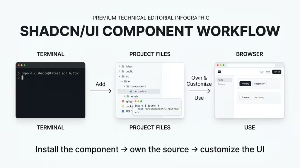
shadcn/ui takes a different approach to every other library in this list. It is not a package you install. It is a collection of copy-and-paste components built on Radix UI primitives and styled with Tailwind CSS. When you add a shadcn/ui component to your project, you own the source code entirely. There is no version dependency to manage, no breaking update to worry about, and no design constraint you cannot override.
This architecture makes shadcn/ui exceptionally powerful for teams building proprietary design systems. The Radix UI foundation handles all accessibility and interaction logic (focus traps, keyboard navigation, ARIA roles), while Tailwind handles all visual styling. You start with a correct, accessible, unstyled primitive and apply your brand identity on top.
The shadcn/ui CLI has improved significantly in 2026, allowing selective component installation with automatic dependency resolution. The project’s theming system, built around CSS variables, makes global design changes clean and predictable.
- Bundle size: Minimal; you only include what you copy
- Learning curve: Low for the component API; moderate for customisation depth
- Best pairing: React or Next.js with Tailwind CSS
14. DaisyUI
Best for: Developers who love Tailwind but want faster UI scaffolding through semantic class names
DaisyUI is a Tailwind CSS plugin that adds a layer of semantic component classes on top of Tailwind’s utilities. Instead of writing bg-blue-600 text-white font-semibold py-2 px-4 rounded-lg for a button, you write btn btn-primary. The Tailwind utilities still exist underneath; DaisyUI simply abstracts common combinations into readable, meaningful names.
The library ships with over 50 components and 35 built-in themes, all of which are mobile-first by nature of Tailwind’s underlying architecture. Switching between themes is as simple as changing a data-theme attribute on the <html> element, making it ideal for projects that need dark mode, branded themes, or multi-tenant white-labelling.
DaisyUI has no JavaScript dependency. Like Bulma, all interactivity must be added by the developer. For simple marketing pages and content sites, that is a reasonable trade-off that keeps the bundle minimal.
- Bundle size: Tiny; CSS only
- Learning curve: Very low; semantic class names are self-explanatory
- Best pairing: Any project already using Tailwind CSS
15. HeroUI (formerly NextUI)
Best for: Next.js projects requiring polished, animation-rich mobile interfaces with minimal configuration
HeroUI, rebranded from NextUI in 2024, is optimised specifically for modern React and Next.js workflows. It is built on Tailwind CSS and Framer Motion, giving every component smooth, performant animations that feel genuinely native on mobile. Transitions, loading states, and micro-interactions are built into the components rather than added as an afterthought.
The library’s theming system uses CSS variables and supports light/dark mode switching natively. Components are server-component compatible, which matters significantly for Next.js App Router projects, where mixing client and server components requires careful component design.
HeroUI’s performance credentials are strong. The library ships with accessibility built in, tree-shaking support for lean bundles, and SSR compatibility that prevents hydration mismatches on mobile-first deployments.
- Bundle size: Moderate; tree-shakeable
- Learning curve: Low; intuitive API with strong documentation
- Best pairing: Next.js App Router, Tailwind CSS
16. Base UI
Best for: Teams needing fully unstyled, headless components with native-feeling mobile interactions
Base UI, developed by the MUI team, is the unstyled, headless component library at the bottom of the accessibility and interaction stack. Where MUI (Material UI) is fully styled and opinionated, Base UI provides the correct interactive behaviours with zero visual styling. You bring your own CSS.
The component that has drawn the most attention in 2026 is Base UI’s Drawer with Snap Points. This component enables native-feeling bottom drawer interactions on mobile: users can drag the drawer to predefined snap positions (25%, 50%, 75%, 100% of screen height), with physics-based motion that adapts to the user’s gesture velocity. This is the kind of interaction behaviour that previously required a native app. Base UI delivers it in a web component.
For teams building design systems from scratch who need correct interaction primitives without inheriting anyone else’s visual decisions, Base UI is the strongest headless option available.
- Bundle size: Minimal; styles come from your own CSS
- Learning curve: Moderate; requires writing all styles yourself
- Best pairing: Any React project with a custom design system
17. Ant Design Mobile
Best for: Enterprise mobile applications with data-heavy interfaces, particularly in markets familiar with Alibaba’s ecosystem
Ant Design Mobile is the mobile-specific counterpart to the widely used Ant Design (AntD) desktop library. While AntD focuses on desktop dashboards and enterprise admin interfaces, Ant Design Mobile provides components purpose-built for touch interactions on small screens: pull-to-refresh lists, swipeable cards, floating menus, bottom navigation bars, and data input components optimised for on-screen keyboards.
The library’s component set is shaped by the design standards of Alipay and other Ant Group products, meaning it has been stress-tested at an extraordinary scale across hundreds of millions of mobile sessions. For developers building finance, logistics, healthcare, or operations applications with complex data requirements, the library’s data-handling components are exceptionally mature.
Ant Design Mobile v5 runs on React and ships with full TypeScript support. The documentation is available in both English and Chinese, and the GitHub community is active.
- Bundle size: Moderate to large; modular imports recommended
- Learning curve: Moderate; thorough documentation helps
- Best pairing: React projects targeting mobile enterprise users
Framework Comparison at a Glance
| Framework | Type | Best Use Case | Mobile Performance | Learning Curve | JS Required |
| React | Application | Interactive web apps, SaaS | High | Moderate | Yes |
| Flutter | Application | Cross-platform native apps | Excellent | Steep (Dart) | No (Dart) |
| Svelte | Application | Performance-critical sites | Excellent | Low-Moderate | Yes |
| Ionic | Application | Hybrid mobile apps | Good | Low | Yes |
| Qwik | Application | E-commerce, landing pages | Best-in-class initial load | Steep | Minimal |
| Astro | Application | Content/editorial sites | Best-in-class static | Low | Optional |
| Tailwind CSS | CSS Utility | Any; full design control | Excellent | Moderate | No |
| Bootstrap | CSS Component | Rapid prototyping, mixed teams | Good | Low | Optional |
| Foundation | CSS Component | Enterprise, accessibility | Good | Moderate-Steep | Optional |
| Bulma | CSS Utility | CSS-only clean layouts | Good | Low | None |
| Mantine | Component Library | Full-featured React apps | High | Moderate | Yes (React) |
| Chakra UI | Component Library | Accessibility-first React | High | Low-Moderate | Yes (React) |
| shadcn/ui | Component Library | Custom design systems | Excellent | Low-Moderate | Yes (React) |
| DaisyUI | Component Library | Tailwind-based fast UI | Excellent | Low | None |
| HeroUI | Component Library | Next.js animated UIs | High | Low | Yes (React) |
| Base UI | Component Library | Headless, custom systems | Excellent | Moderate | Yes (React) |
| Ant Design Mobile | Component Library | Enterprise mobile data apps | High | Moderate | Yes (React) |
Which Framework Should You Pick? Scenario-Based Recommendations
Decision frameworks are only useful if they produce clear outputs. Here are scenario-based recommendations for the most common project types DSE’s audience builds.
Scenario 1: You are a solo developer building a content blog or editorial publication. Use Astro with Tailwind CSS. You get zero-JavaScript-by-default performance, native Markdown/MDX support, and complete visual control. Pair with shadcn/ui components for any interactive elements you need.
Scenario 2: You are an educator launching a course platform or membership site. Use Next.js (React) with shadcn/ui and Tailwind CSS. The server-side rendering and app router handle authentication and dynamic content well, and shadcn/ui gives you the component depth for dashboards, forms, and content layouts.
Scenario 3: Your team needs to ship a corporate web presence fast with mixed developer seniority. Use Bootstrap 5. The documentation is unmatched, the component set covers every common UI pattern, and developers of any level can contribute without ramp-up time. Pair with DaisyUI if you want faster theming.
Scenario 4: You are building a mobile app for users in Africa, South Asia, or Southeast Asia with constrained bandwidth. Use Qwik for the web layer or Flutter for cross-platform native. Both eliminate the hydration overhead that cripples performance on 3G connections. If your team prefers standard web tech over Dart, Qwik with DaisyUI is the most pragmatic stack.
Scenario 5: You are building a data-heavy enterprise dashboard. Use React with Mantine or Ant Design Mobile, depending on whether your users are primarily on desktop-first enterprise systems (Mantine) or mobile-first field operations contexts (Ant Design Mobile).
Scenario 6: Your project requires a fully custom design system with no inherited visual opinions. Use SvelteKit with Base UI for the headless interaction primitives, and build your own CSS on top. This is the highest-effort route but produces the most distinctly branded, performant result.
FAQ: Mobile-First Front-End Frameworks 2026
1. What is the best mobile-first front-end framework in 2026? There is no single best answer, and anyone claiming otherwise is selling a preference, not a strategy. The best framework depends on your project type, team skill set, and performance requirements. React with Next.js is the strongest all-rounder. Svelte and Qwik lead on raw mobile performance. Bootstrap wins on team accessibility and speed to prototype.
2. Is Bootstrap still relevant in 2026? Absolutely. Bootstrap 5 powers over 26% of the top websites globally and has over 600 million downloads to date. Its 12-column responsive grid, comprehensive component set, and zero jQuery dependency make it a practical, battle-tested choice for teams that prioritise reliability and documentation depth over cutting-edge architecture.
3. What is the difference between a CSS framework and a component library? A CSS framework (like Bootstrap, Tailwind, Bulma, Foundation) provides the styling and layout rules for your interface. A component library (like Mantine, Chakra UI, shadcn/ui) provides pre-built, interactive UI components that include both behaviour and style. Many projects use both a CSS framework as the base and a component library for complex interactive elements.
4. Should I use Tailwind CSS or Bootstrap in 2026? Use Tailwind if your team has the design experience to build a consistent UI from utility classes and wants full visual control. Use Bootstrap if your team needs a comprehensive, opinionated starting point and values documentation and convention over flexibility. Many projects use Tailwind with shadcn/ui components, combining the control of a utility-first system with the speed of pre-built components.
5. What is the most performant framework for mobile users in emerging markets? Qwik and Astro consistently produce the best initial load performance on mobile connections. Svelte-compiled apps are also excellent. For native mobile apps targeting low-bandwidth markets, Flutter’s compiled output outperforms most JavaScript-based hybrid solutions.
6. What is shadcn/ui and why is it so popular? shadcn/ui is a collection of copy-and-paste React components built on Radix UI primitives and styled with Tailwind CSS. Its popularity stems from a key architectural choice: you own the code. There is no package to update, no version lock-in, and no visual constraints that you cannot override. For teams building proprietary design systems, this ownership model is highly appealing.
7. Is Flutter good for web development? Flutter Web has matured significantly, but remains best suited for web app experiences rather than SEO-sensitive content sites. Its HTML renderer has improved accessibility, and its Wasm-based CanvasKit renderer delivers excellent performance for graphics-intensive interfaces. For content-heavy, indexable sites, use a JavaScript-based framework instead.
8. What is Qwik’s “resumability” approach, and why does it matter? Resumability is an alternative to hydration. Traditional frameworks re-execute all application code in the browser to make a server-rendered page interactive. Qwik serialises the application’s execution state on the server, sends it to the browser, and resumes execution from that point only when a user triggers an interaction. The result is that the browser does minimal JavaScript work on initial load, dramatically reducing time to interactive on mobile devices.
9. What component library should I use with Next.js? The strongest options are shadcn/ui (for full design ownership), HeroUI (for animation-rich interfaces), Mantine (for comprehensive component coverage), and Chakra UI (for accessibility-first development). All four are compatible with Next.js App Router and support server components where applicable.
10. Is Ionic Framework still a good choice in 2026? Ionic remains the best option for web developers who need to deliver a mobile app without switching to native development. Capacitor, Ionic’s native bridge layer, now supports a wide range of device APIs and has matured considerably. For business apps with standard UI patterns, Ionic with React is an efficient, well-documented path to a cross-platform mobile release.
11. What is the difference between Foundation and Bootstrap? Both are comprehensive mobile-first CSS frameworks, but Foundation is more enterprise-oriented, more modular, and offers deeper accessibility support out of the box. Bootstrap has a significantly larger community, more third-party templates, and a gentler learning curve. For most teams, Bootstrap is the faster start; for regulated industries or advanced accessibility requirements, Foundation is the stronger long-term investment.
12. Can I use multiple frameworks together? Yes, with intention. A common and effective combination is Next.js (application layer) + Tailwind CSS (styling layer) + shadcn/ui (component layer). You can also pair Astro with React islands that use Chakra UI. The key is ensuring your choices serve a coherent performance and developer experience strategy, not simply stacking tools because they are popular.
Mobile-first front-end development in 2026 is beyond a trend. It is the baseline expectation for any project that takes performance, search visibility, and user experience seriously. The frameworks covered in this guide represent the best available options across every tier of the stack: from foundational application frameworks that determine how your code is compiled and rendered, through CSS systems that control your responsive layout, to component libraries that accelerate the construction of accessible, interactive interfaces.
The honest recommendation: resist the urge to chase the newest framework. Match your tool to your project’s specific needs, your team’s existing skills, and your performance requirements for the devices and connections your actual users will bring. A well-configured Bootstrap 5 site will outperform a poorly configured Qwik app every time.
For most DSE readers building educational platforms, content sites, or creator tools, the React + Next.js + Tailwind CSS + shadcn/ui stack offers the best balance of performance, ecosystem depth, and community support. For content-only sites, Astro with Tailwind CSS is the cleanest, fastest path to excellent mobile scores. For hybrid mobile apps, Ionic with React remains the most practical bridge from web development to app store deployment.
Start with one framework that fits your project type. Master it fully. Then expand your toolkit as specific project needs arise.
If you want to align your technical stack with a broader digital strategy that serves your audience, grows your platform, and delivers measurable results, book a Transformation Clarity Call (TCC) with DSE Consultants. We help creators, educators, and developers make decisions that compound over time.