


You have written the book. Months, perhaps years, of ideas, effort, and craft are sitting in a document on your screen. But there is a gap between a finished manuscript and a finished book, and that gap is called formatting.
Readers notice formatting before they read a single sentence. The moment they open your book, their eyes scan the page for visual cues: Is this comfortable to read? Does this feel professional? Is this worth my time? Poor formatting answers all three questions with doubt. Clean, precise formatting answers them with confidence.
Research in cognitive psychology and typography shows that typography and visual layout significantly affect comprehension and reading speed. When text is properly spaced, sized, and structured, readers retain more and fatigue less, reducing cognitive burden on working memory and attention processes.
This guide covers every formatting setting your book needs, from page setup to final file export, with specific step-by-step instructions for Google Docs, Microsoft Word, and WPS Docs. Whether you are formatting your first manuscript or your tenth, this is the complete reference you need.
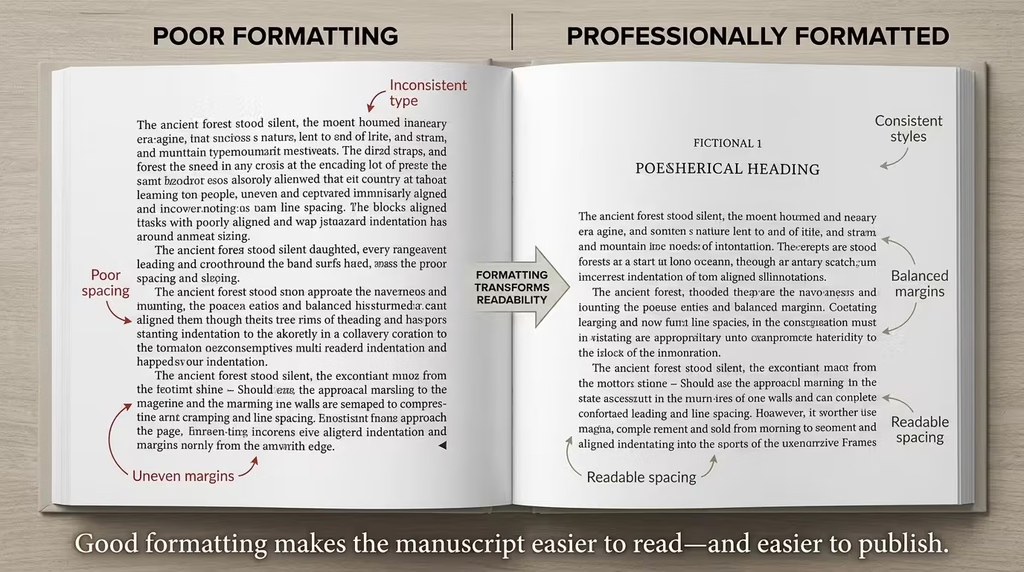
Table of Contents
Disclosure: Our content is designed to help you experience digital transformation across your areas of interest and needs. Digital Solutions Edge is reader-supported; when you engage with our recommendations or click certain links, we may receive a commission. This support allows us to continue delivering the digital solutions you rely on. Thank you for being part of our community.
Choosing Your Word Processor: Google Docs, Microsoft Word, or WPS Docs
Before you set a single margin or select a font, you need to know what your tool can and cannot do. Each word processor has genuine strengths, and the right choice depends on your workflow, budget, and publishing destination.
Google Docs
Google Docs is cloud-based, free, and easy to access from any device. It is excellent for collaborative writing, drafting, and basic formatting. Its section break controls, header management, and alternating page settings are fully capable of book formatting, though some advanced options (such as fine-tuned glyph control or professional typesetting features) are absent. For most independent authors and self-publishers, Google Docs is sufficient.
Best for: Collaborative projects, authors who write across multiple devices, and budget-conscious publishers.
Limitations: Slower performance with very long documents (80,000+ words), fewer export options compared to Word, and less precision for print-ready files.
Microsoft Word
Microsoft Word remains the industry gold standard for manuscript preparation and book formatting. It offers unmatched control over styles, section breaks, hyphenation, glyph settings, paragraph rules, widows and orphans, and print-ready export. Most traditional publishers and many KDP authors use Word as their primary formatting environment.
Best for: Authors preparing print-ready files, manuscripts destined for traditional publishing, and complex formatting projects.
Limitations: Subscription cost (Microsoft 365), steeper learning curve for advanced features.
WPS Docs
WPS Docs is a powerful, largely free alternative to Microsoft Office that mirrors Word’s interface closely. It handles most book formatting tasks competently and is a strong choice for authors who want Word-like functionality without the subscription cost. File compatibility with .docx is strong.
Best for: Budget-conscious authors who need more control than Google Docs provides, Windows and Android users.
Limitations: Some advanced formatting features differ slightly from Word’s behaviour; less support documentation is available.
Understanding Book Structure Before You Format a Single Page
Professional book formatting begins with understanding the three structural divisions of a book. Every formatting decision you make, from headers to page numbers to section breaks, connects back to these divisions.
Front Matter
Front matter precedes your main content and typically includes:
- Title Page — book title, subtitle, author name, publisher information
- Copyright Page — copyright notice, ISBN, edition details, disclaimers
- Dedication (sometimes placed here, though also common in back matter)
- Table of Contents — linked list of chapters and sections
- Foreword or Preface (if applicable)
- Acknowledgements (if placed at the front)
Front matter pages are traditionally numbered with Roman numerals (i, ii, iii) or counted silently as blind folios with no visible number.
Body Matter (Main Content)
This is the heart of your book: all chapters, parts, and sections that carry your core message or story. Body matter typically begins on page 1 (Arabic numerals) and runs through to the final chapter.
Back Matter
Back matter follows your final chapter and may include:
- Dedication (if not placed in front matter)
- Acknowledgements
- Bibliography or References
- Appendices
- Author Bio
- Index
Each of these three divisions may require different header behaviour, different page numbering schemes, and different section settings. That is why understanding the structure first saves enormous time later.
Page Setup: The Foundation Every Formatting Decision Rests On
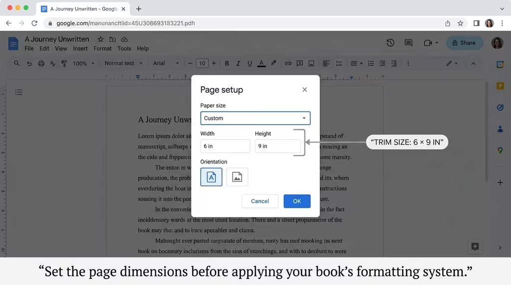
Page setup is the first technical step in formatting your book. Every subsequent decision, fonts, margins, headers- depends on the dimensions you set here. Do this before formatting a single paragraph.
Choose Your Trim Size
Trim size is the physical dimension of your printed book. Common sizes for independent authors include:
| Book Type | Common Trim Sizes |
|---|---|
| Fiction / Memoir | 5 x 8 inches / 5.25 x 8 inches |
| Non-fiction / How-To | 6 x 9 inches / 5.5 x 8.5 inches |
| Children’s / Gift | 7.5 x 7.5 inches / 8 x 8 inches |
| Textbook / Academic | 7 x 10 inches / 8.5 x 11 inches |
Choose your trim size based on your publishing platform’s specifications. Amazon KDP, IngramSpark, and Draft2Digital each publish their supported sizes, and selecting a standard size reduces print costs significantly.
Setting Page Size in Each Word Processor
Google Docs: Go to File > Page setup. Under “Paper size,” select “Custom” and enter your trim size in inches. Set orientation to Portrait. Click “Set as default” to apply to the entire document.
Microsoft Word: Go to Layout > Size > More Paper Sizes. Enter your custom width and height. Confirm orientation is set to Portrait under the same dialogue.
WPS Docs: Go to Page Layout > Page Setup > Paper. Choose “Custom size” and enter your dimensions. Apply to “Whole document.”
Orientation
Always use Portrait orientation for standard book pages. Landscape is only appropriate for specific sections such as wide tables, charts, or certain children’s book layouts.
Page Breaks vs. Section Breaks
This distinction is critical and frequently misunderstood:
- Page breaks simply push content to the next page. They carry all formatting from the previous section with them. Use them only for minor layout nudges within a chapter.
- Section breaks create a structural boundary. They allow each new section to have independent headers, footers, page numbering, and margin settings. Use them for every major transition: front matter to body, chapter to chapter, body to back matter.
Margins: Creating Visual Breathing Space and Binding Allowance
Margins are the white space that surrounds your text block. They are not wasted space. Margins rest the reader’s eye, prevent text from running too close to edges (which printers sometimes clip), and provide the physical space needed for binding.
Recommended Margin Settings for Print Books
| Position | Recommendation |
|---|---|
| Top | 0.75 inch to 1 inch |
| Bottom | 0.75 inch to 1 inch |
| Outside (left for verso, right for recto) | 0.5 inch to 0.75 inch |
| Inside (gutter) | 0.875 inch to 1.25 inch (increases with page count) |
The gutter margin (the inside margin that runs along the binding) deserves particular attention. For books with high page counts, the binding consumes more physical space, requiring a wider gutter so that text does not disappear into the spine. Amazon KDP provides specific gutter guidelines based on page count — always check your platform’s requirements.
Setting Mirrored Margins
For a book with facing pages (left and right), you need mirrored margins so that the inside margin is always the wider one, regardless of which side of the spread the page falls on.
Google Docs: Go to File > Page setup. Unfortunately, Google Docs does not support true mirrored margins natively. As a workaround, set your inside margin value on both the left and right fields. For a fully mirrored print layout, consider exporting to Word for final margin control.
Microsoft Word: Go to Layout > Margins > Custom Margins. Under “Multiple pages,” select “Mirror margins.” Adjust the “Inside” and “Outside” values separately. This is one area where Word has a clear advantage.
WPS Docs: Go to Page Layout > Margins > Custom Margins. Select “Mirror margins” under “Multiple pages.” Enter your values.
Margins for Digital-Only Books
If you are formatting exclusively for digital reading (ePub or Kindle), margins matter less because e-readers allow users to adjust them. Focus instead on clean paragraph structure, reliable heading styles, and proper headings for navigation. Many formatting experts recommend keeping digital margins minimal (0.5 inch on all sides) and letting the reader’s device handle the rest.
Typography and Font Selection: What Readers Feel Without Knowing Why
Font selection is one of those decisions readers rarely consciously notice but always subconsciously feel. The right font disappears into the reading experience. The wrong one creates friction on every page.
Body Text Fonts
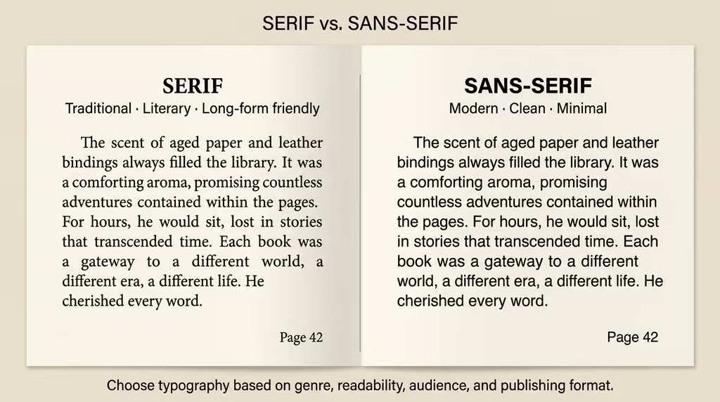
Body text carries the vast majority of your word count, so readability across hundreds of pages is the primary criterion. Serif fonts are widely preferred for print books because the small strokes at the tips of letterforms help guide the eye horizontally along each line.
Reliable choices for print body text include:
- Garamond — elegant, classical, highly readable, commonly used in literary fiction
- Palatino — slightly wider than Garamond, excellent for non-fiction
- Times New Roman — familiar and safe but considered generic by many designers
- Georgia — designed for screen readability, works well in digital formats
- Book Antiqua — warmer than Times, good for memoir and narrative non-fiction
- Caslon — a traditional book typeface with excellent legibility
For digital-first books, sans-serif fonts such as Helvetica, Lato, or Open Sans can work well, particularly in non-fiction and business titles.
Font Size for Body Text
Standard body text size for most print books falls between 10pt and 12pt, depending on the typeface. Some fonts (Garamond, for instance) run slightly smaller optically, so 11pt or 11.5pt is common. Test your chosen font at your target size by printing a sample page before committing.
For digital formats, 11pt to 12pt is standard. E-readers allow the user to resize, so this matters less for ePub outputs.
Heading Fonts
Your chapter headings and subheadings may use the same font as your body text in a heavier weight (bold), or a complementary font for visual contrast. If you use a second font for headings, ensure it harmonises with the body font rather than competing with it.
A reliable pairing approach: use a sans-serif heading font with a serif body font. For example, Oswald or Raleway headings with Garamond body text create a clean, modern-traditional contrast.
Limit yourself to two font families maximum across the entire book. More than two creates visual noise.
What to Avoid
- Script or decorative fonts for body text (charming on a cover, unreadable over 300 pages)
- All-caps in large paragraphs
- Fonts below 9pt in print (readability collapses)
- Bold or italic overuse in body text (reserve bold for genuine emphasis, italic for titles and key terms)
Paragraph Formatting: Indents, Alignment, and the Rules of Body Text
Paragraph formatting sets the visual rhythm of your pages. Done correctly, it becomes invisible. Done poorly, it announces itself on every spread.
First-Line Indentation
The standard method for separating paragraphs in print books is first-line indentation, not blank lines between paragraphs. This is a key distinction between book formatting and web content formatting.
The standard first-line indent for print is 0.25 inch to 0.5 inch (approximately 1–1.5 em in typographic terms). Do not use the Tab key to create indents. Use your word processor’s paragraph settings.
Google Docs: Go to Format > Align & indent > Indentation options. Under “Special indent,” select “First line” and set your value (e.g., 0.5 inch).
Microsoft Word: Go to Home > Paragraph settings (click the small arrow in the corner of the Paragraph group). Under “Indentation,” set “Special” to “First line” with your preferred value.
WPS Docs: Go to Paragraph settings via the Home tab. Set “Special” indent to “First line.”
Exception: The first paragraph of every chapter (directly following the chapter title) typically has no indent. This is a longstanding typographic convention. Apply “No indent” to that opening paragraph using a character style or manual override.
Text Alignment
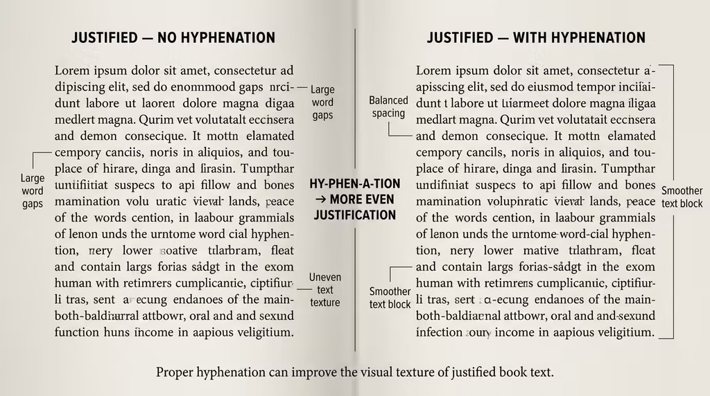
Justified alignment (text aligned to both the left and right margins) is standard for print books. It creates clean, symmetrical columns of text that look professional on the page.
Left-aligned (ragged right) text is preferred by many designers for digital books because irregular line endings are less jarring on screens than justified text with poor hyphenation control.
To set justified alignment:
Google Docs: Format > Align & indent > Justified (or Ctrl + Shift + J)
Microsoft Word: Home > Paragraph group > Justify button (or Ctrl + J)
WPS Docs: Home > Justify
Avoid These Paragraph Mistakes
- Pressing Enter twice between paragraphs creates uneven spacing that is difficult to remove consistently.
- Pressing the space bar or Tab key multiple times to create indentation (breaks when text reflows)
- Centre-aligning body text (exhausting to read in long passages)
- Using different indentation styles in different chapters
Line Spacing and Paragraph Spacing: The Invisible Architecture of Readability
Spacing is one of the most powerful levers in book formatting. The right spacing makes pages feel open and approachable. Too little, and the text feels suffocating. Too much, and it feels padded and amateurish.
Line Spacing (Leading)
Line spacing (called “leading” in typographic terms) is the vertical distance between lines of text. The goal is enough space for each line to stand clearly without the eye confusing it with the line above or below.
Recommended line spacing for print books: 120% to 145% of the font size. In practical terms:
- 11pt font: set line spacing to approximately 13–15pt
- 12pt font: set line spacing to approximately 14–17pt
In word-processor terms, “Multiple” spacing of 1.1 to 1.3 typically achieves this range. Avoid “Double” spacing in final book layouts; this is for manuscripts submitted to editors, not final formatted books.
Setting line spacing:
Google Docs: Format > Line & paragraph spacing > Custom spacing. Enter your value in the “Line spacing” field.
Microsoft Word: Home > Line Spacing > Line Spacing Options. Set “Line spacing” to “Multiple” and enter your value (e.g., 1.2).
WPS Docs: Paragraph settings > Line spacing > Multiple. Enter your value.
Paragraph Spacing (Space Before and After)
In a print book using first-line indentation, you typically set zero space before and zero space after paragraphs in body text. Spacing is handled visually by the first-line indent rather than blank vertical gaps.
For headings, scene breaks, and special elements, you will add space before and after. Recommended heading spacing:
| Element | Space Before | Space After |
|---|---|---|
| Chapter Title (H1) | 36–72pt | 24–36pt |
| Section Heading (H2) | 18–24pt | 12–18pt |
| Subheading (H3) | 12–18pt | 8–12pt |
| Scene Break (***) | 12pt | 12pt |
Set these values via Format > Paragraph settings in all three word processors.
Never Use Blank Lines for Spacing
Pressing Enter to add blank lines between paragraphs creates spacing that cannot be reliably controlled when text reflows. It produces visually inconsistent results across different devices and platforms. Use paragraph spacing settings instead.
Hyphenation Settings: The Overlooked Detail That Cleans Up Your Pages
Hyphenation is rarely discussed in beginner formatting guides, but it has a meaningful impact on the visual quality of your pages, particularly with justified text.
When text is justified, the word processor stretches spaces between words to fill each line. Without hyphenation enabled, this can create “rivers”, distracting white channels running vertically through paragraphs. Hyphenation allows the processor to break long words across lines, reducing the need for excessive word spacing.
Enabling Hyphenation
Google Docs: Go to Tools > Preferences > check “Automatically hyphenate words.” Note: Google Docs’ hyphenation is fairly basic compared to Word.
Microsoft Word: Go to Layout > Hyphenation > Automatic. In the Hyphenation options dialogue, you can also control:
- Hyphenation zone: The amount of space allowed at the end of a line before hyphenation kicks in. A smaller zone means more hyphenation; a larger zone means fewer hyphens but more uneven spacing.
- Limit consecutive hyphens to: Set this to 2 or 3. More than three consecutive hyphenated lines look awkward in print.
WPS Docs: Go to Page Layout > Hyphenation > Automatic. Similar controls to Word are available.
When Not to Hyphenate
- Headings and chapter titles should never be hyphenated
- Proper nouns and names should not be broken across lines
- Short documents or ebooks where reflow is expected do not benefit much from hyphenation
Headings and Subheadings: Structuring Content That Guides the Reader
Well-formatted headings serve as the skeleton of your book. They help readers navigate, signal structure, and visually break up content so that long chapters do not feel impenetrable.
The Heading Hierarchy
A clear heading hierarchy uses consistent levels:
- H1: Chapter titles, the most prominent heading in the book
- H2: Major section headings within a chapter
- H3: Subsections within a major section
- H4 and below: Use sparingly; too many levels create confusion
Each level should be visually distinct from the others. Achieve distinction through size, weight, spacing, or a combination of all three.
Chapter Title Formatting (H1)
Chapter titles deserve prominent treatment:
- Place them roughly one-third of the way down the page (called a “chapter drop”), which is the convention in most traditionally published books
- Centre them or left-align them consistently
- Apply generous space above (to push them down the page) and space below (to separate the title from the opening text)
- Use a slightly larger font size (16pt to 24pt, depending on your body text size and chosen typeface)
To create the chapter drop in Google Docs or Word, add space before the chapter title using paragraph spacing settings (typically 72pt to 144pt of space before, depending on your desired drop position).
Section Headings (H2)
Section headings should be noticeably subordinate to chapter titles but still clearly distinct from body text. Common approaches:
- Same font as body text but bold, one or two sizes larger
- Small caps treatment (available in Word under Font > Effects > Small caps)
- Left-aligned (the most common choice for non-fiction)
Subheadings (H3 and Below)
Subheadings are workhorses of non-fiction books. Keep them clean and subordinate. A bold version of your body text at the same size, separated by appropriate spacing, is a reliable approach.
Do not use more heading levels than your content genuinely requires. Every added level increases cognitive load for the reader.
Using Styles: The Single Most Powerful Formatting Tool in Any Word Processor
Styles are pre-defined sets of formatting that you apply to text with a single click. They are the single most important tool for producing a consistent, professional book layout, and they are built into all three word processors.
Why Styles Matter for Books
When you format a chapter title manually 31 times, you introduce the risk of 31 slightly different versions of that title’s formatting. When you apply a “Chapter Title” style 31 times, every instance is guaranteed to be identical. Change the style once, and all 31 chapters update instantly.
Styles also drive the automatic Table of Contents feature, making TOC generation clean and reliable. They are the backbone of any professional formatting system.
Essential Styles to Define
| Style Name | Purpose |
|---|---|
| Normal | Body text (your primary style) |
| Chapter Title | H1-level chapter headings |
| Section Heading | H2-level section headings |
| Subheading | H3-level subheadings |
| First Paragraph | Body text with no first-line indent (for chapter openers) |
| Block Quote | Indented quotations |
| Caption | Image or table captions |
| Header Text | Text used inside page headers |
| TOC Entry | Table of contents entries |
Creating and Modifying Styles
Google Docs: Format text the way you want it to appear. Select it. In the Styles dropdown (top-left of the toolbar, usually showing “Normal text”), click the arrow next to the style you want to update and select “Update ‘[Style Name]’ to match.” This applies the formatting across all instances.
Microsoft Word: In the Home tab, find the Styles pane. Right-click on any style and select “Modify.” Adjust all settings (font, size, spacing, indent) within the Modify Style dialogue. Check “Automatically update” with caution; it works best when applied to heading styles, not body text.
WPS Docs: Home tab > Styles pane. Right-click a style > Modify. Controls mirror Word’s interface closely.
Apply Styles, Not Manual Formatting
Once your styles are defined, resist the urge to manually override them with direct formatting. Every manual override is a future inconsistency waiting to happen. If you need a variation, create a new derived style rather than applying one-off formatting.
Section Breaks: The Engine Behind Professional Book Control
Section breaks are the structural scaffolding of a professionally formatted book. Without them, headers and footers behave the same across your entire document, page numbering cannot be reset, and different parts of your book cannot be independently controlled.
Types of Section Breaks
| Break Type | What It Does |
|---|---|
| Next Page | Starts the next section on the following page (most commonly used) |
| Continuous | Starts a new section without a page break (rare in books) |
| Odd Page | Forces the next section to start on an odd-numbered (right-hand) page |
| Even Page | Forces the next section to start on an even-numbered (left-hand) page |
For book formatting, you will primarily use Next Page section breaks between chapters and Odd Page section breaks when you want to enforce professional recto/verso starting positions (such as ensuring Chapter 1 always opens on the right).
Where to Insert Section Breaks in Your Book
A well-structured 31-chapter book (like the one referenced in the formatting notes attached to this guide) should have section breaks at these positions:
- End of last front matter page (before Chapter 1)
- End of every chapter (before the next chapter begins)
- End of final chapter (before back matter begins)
This gives you 33 sections for a 31-chapter book with separate front and back matter.
Inserting Section Breaks
Google Docs: Insert > Break > Section break (next page) or Section break (continuous)
Microsoft Word: Layout > Breaks > Section Breaks > Next Page / Odd Page / Even Page
WPS Docs: Page Layout > Breaks > Section Breaks > same options as Word
Unlinking Headers and Footers Between Sections
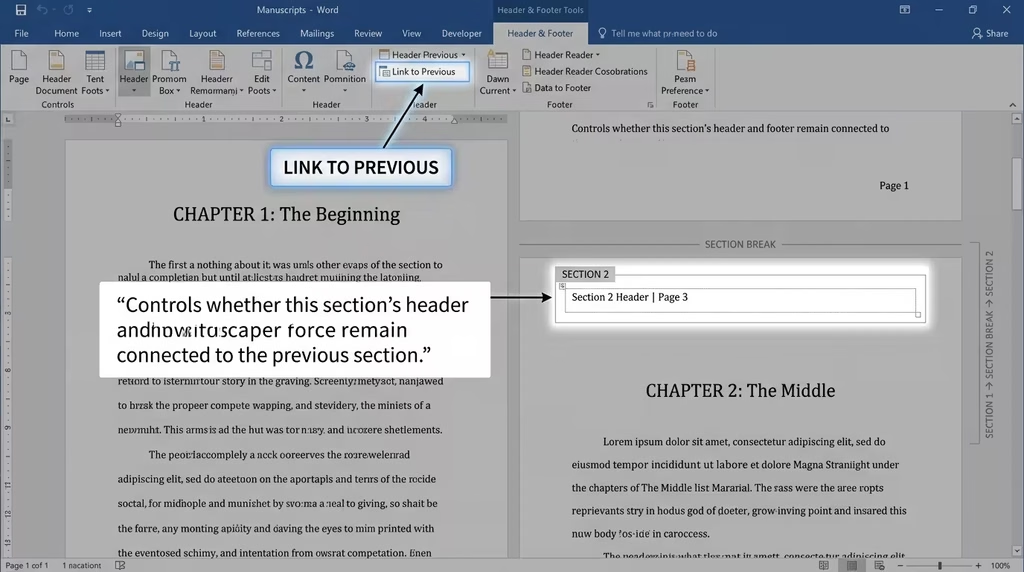
After inserting a section break, headers and footers in the new section are automatically linked to the previous section (“Same as Previous” or “Link to Previous” is on by default). This means any change to the header in the new section changes all previous sections too.
To give each chapter its own header, you must unlink the header at the start of each new chapter:
- Double-click the header area
- Look for “Link to previous” in the Header & Footer toolbar and click to uncheck/deactivate it
- Now type the new chapter title in the header without affecting previous chapters
This unlinking step must be performed for every single chapter. It takes a few extra minutes, but it is what separates a professionally formatted book from a messy one.
Headers and Footers: Setting Up a Professional Alternating Book Layout
Headers and footers give your book a finished, polished identity. They help readers orient themselves, knowing which book they are reading and which chapter they are in without any conscious effort. The professional standard for books with body content uses alternating (odd/even) headers.
Professional Header Convention
| Page Position | Header Content |
|---|---|
| Even pages (left/verso) | Book Title |
| Odd pages (right/recto) | Chapter Title |
Even page headers align left (toward the outer edge of the spread), and odd page headers align right, so that both headers naturally sit at the outside edges of the open book. This is the visual standard you see in virtually every traditionally published book.
Enabling Alternating Headers
Google Docs: Double-click the header area. Click “Options” (top-right of the header banner) > Header format. Check “Different odd & even.” Click Apply. You now have separate header fields for odd and even pages across your entire document.
Microsoft Word: Go to Insert > Header > Edit Header. In the Header & Footer Design tab, check “Different Odd & Even Pages.” Separate header areas now exist for odd and even pages.
WPS Docs: Double-click the header area. In the Header & Footer toolbar, check “Different Odd & Even Pages.”
Setting the Book Title (Even Pages)
Navigate to any even-numbered page. Double-click the header. Type your book title. Because even page headers are linked across all sections by default (and you want them to remain that way), leave “Link to previous” checked on even pages. Your book title will automatically appear on every even page throughout the entire document after this single entry.
Align this text to the left.
Setting Chapter Titles (Odd Pages)
Odd-page headers require individual management for each of your 31 chapters (or however many chapters your book contains). For each new chapter:
- Insert a section break (next page) at the end of the previous chapter
- Navigate to the first odd page of the new chapter
- Double-click the header
- Uncheck “Link to previous” for the odd header only
- Type the specific chapter title
- Align this text to the right
Repeat this process for every chapter. It is methodical work, but it is the correct way to produce a professional, accurate alternating header system.
Front Matter: No Headers
Front matter pages (title page, copyright page, TOC) should have no headers or, at most, minimal ones. Use the “Different first page” setting in the front matter section, or unlink and clear those headers entirely.
Chapter Opening Pages: No Headers
The first page of every chapter traditionally has no header. This is a standard publishing convention. To achieve this in any word processor, use the “Different first page” setting within each chapter’s section:
- Double-click the header on the first page of the chapter
- Check “Different first page”
- Leave the first-page header blank
Critical note: When you check “Different first page,” the setting applies to both the header AND the footer in that section simultaneously. If your footer contains page numbers, the number may disappear on the chapter opening page. You will need to manually re-enter the page number in the first-page footer of each chapter that uses this setting.
What Goes in the Footer?
Footers in most books contain only page numbers. Keep them clean. Some books place the page number at the outside edge of the footer (left on verso pages, right on recto pages) to mirror the header alignment. Others centre the page number in the footer.
Centred page numbers are slightly simpler to manage in word processors and look clean and neutral. Outside-edge page numbers look slightly more professional in print and are the traditional choice.
Page Numbering: The Complete System for Front Matter, Body, and Back Matter
Page numbering in a professionally formatted book is not a single, continuous run of numbers from page 1 to the end. It is a structured system that treats each major division of the book with different rules.
Standard Page Numbering Convention
| Section | Numbering Style | Visibility |
|---|---|---|
| Title page | Counted, but no number was displayed | Hidden (blind folio) |
| Copyright page | Counted, but no number was displayed | Hidden (blind folio) |
| Table of Contents | Roman numerals (i, ii, iii) or hidden | Often hidden |
| Chapters (Body) | Arabic numerals starting at 1 | Displayed |
| Back matter | Continues from body matter | Displayed |
| Blank pages | Counted, but no number was displayed | Hidden |
Starting a New Numbering Sequence
After your front matter, you want Chapter 1 to begin with Arabic numeral 1. Here is how to set that up:
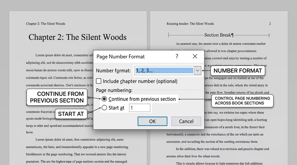
Google Docs: Insert > Page numbers > More options. In the dialogue box, find “Page numbering” for the current section. Change “Start at” to 1. Ensure “Continue from previous section” is NOT checked for this section.
Microsoft Word: Double-click the footer in Chapter 1’s section. Go to Insert > Page Number > Format Page Numbers. Set “Start at” to 1. Click OK.
WPS Docs: Double-click the footer > Insert > Page Number > Format Page Numbers. Same controls as Word.
Blank Pages and Page Count Continuity
This is one of the most frequently misunderstood aspects of book pagination: blank pages are always counted in the sequence, even when no number is displayed.
If your TOC ends on page 5 (an odd page) and you need Chapter 1 to begin on page 7 (an odd page), then page 6 exists as a blank verso page. It is page 6 in the book’s sequence. The page number counter in your word processor must include it in its count. If you skip it, odd-numbered pages end up on the left (verso) side, which breaks the entire recto/verso system.
Using an “Odd page” section break handles this automatically. The word processor internally counts the implied blank page without you needing to manually insert a blank page.
Checking Continuity After Section Breaks
After every section break, double-click the footer in the new section and verify:
- “Continue from previous section” is selected (unless this is the start of a new numbering system)
- The displayed page number matches the correct sequence
Chapter Opening Pages: The Clean, Intentional First Impression
The first page of a chapter is a moment of visual pause in the reading experience. After finishing one chapter, the reader turns the page, and the chapter opening gives them a breath before they begin again. Professionally published books treat this moment with care.
Standard Chapter Opening Format
- Chapter drop: The chapter number and title begin approximately one-third to one-quarter of the way down the page, not at the top. This is created with a large “space before” value in the chapter title paragraph style (typically 100pt to 180pt, depending on your page height).
- No header: The first page of every chapter has a blank header. Apply “Different first page” within the chapter’s section.
- Page number in footer: Even without a header, the page number typically remains visible in the footer on chapter opening pages. You must manually re-enter this after applying “Different first page” if it disappears.
- No indent on first paragraph: The first paragraph of a chapter does not use first-line indentation. Subsequent paragraphs do. Apply a separate “First Paragraph” or “Chapter Opening” style with no indent to handle this.
Creating the Chapter Drop
Google Docs: Select the chapter title text. Go to Format > Paragraph styles > Edit. Under “Spacing,” set “Before paragraph” to a high value (e.g., 100pt or more). Adjust until the title sits approximately one-third down the page.
Microsoft Word: Right-click the chapter title style in the Styles pane > Modify > Format > Paragraph. Set “Spacing before” to your desired value.
Chapter Numbers vs. Chapter Titles
Some books display only “Chapter 1” as the chapter identifier. Others display “Chapter 1” on one line and the chapter title on the next. Still others drop the word “Chapter” and display only a numeral or only the title.
Choose a format and apply it consistently through all 31 (or more) chapters. Your styles system makes this easy: define it once in the H1 and a supporting subtitle style, and it applies uniformly.
Blank Pages and Blind Folios: Counting What You Cannot See
In professional book publishing, a page that contains no visible content is called a blind folio. The term acknowledges that the page has a number in the sequence (it is not a non-page), but that number is not printed or displayed.
When Blank Pages Appear
Blank pages appear in your book when:
- A chapter ends on a recto (odd, right-hand) page, and the next chapter must also begin on a recto page. The intervening verso (even, left-hand) page is left blank.
- Your front matter requires a section to begin on a right-hand page, but the previous section ended on a right-hand page as well.
These blanks are structurally necessary. They are not mistakes.
Rules for Blank Pages
A blank page must contain:
- No header (no book title, no chapter title)
- No footer (no page number)
- No stray paragraph marks or extra spaces
A blank page should appear empty to the reader.
How Blank Pages Affect Your Page Count
The blank page IS page N. The following page is page N+1. Your word processor must count the blank page internally, even if nothing is displayed on it. If you skip the count, your odd/even page assignment flips, which is a significant formatting error in print publishing.
Using Odd Page section breaks handles this automatically: the word processor creates the implied blank page and maintains the correct count without you manually inserting it.
Table of Contents Formatting: Clean, Accurate, and Easy to Navigate
The Table of Contents is often the first inside page a reader turns to after the title page. It sets the tone for everything that follows. A clean, well-structured TOC communicates that the book has been produced with care.
TOC Structure and Standards
- Placement: After the copyright page, beginning on an odd (recto) page
- Entries: Chapter number (if used), chapter title, and page number
- Alignment: Chapter titles left-aligned, page numbers right-aligned
- Leaders: Dot leaders (…….) connecting titles to page numbers are optional. They improve readability when entries span long horizontal distances
- Depth: Most books list only H1-level chapter titles. Non-fiction books with complex structure may list H2-level sections as well, but avoid going deeper than two levels in the TOC.
Generating the TOC Automatically
The single best way to create a TOC is to generate it automatically from your heading styles. This ensures it always matches your actual chapter titles and page numbers exactly.
Google Docs: Insert > Table of contents. Choose a style. The TOC auto-generates from all Heading 1, 2, and 3 text. Update it by clicking inside and pressing the refresh icon.
Microsoft Word: References > Table of Contents > choose from built-in styles or “Custom Table of Contents.” Word generates the TOC from all styled headings. Update by right-clicking and selecting “Update Field” > “Update entire table.”
WPS Docs: References > Table of Contents. Same options as Word.
Customising TOC Appearance
After auto-generation, you can manually format the TOC appearance using the TOC styles (TOC 1, TOC 2, etc.) to adjust fonts, spacing, and leader characters. Always update the TOC after making all final edits to chapter titles or page layout, as numbers and titles shift when content is added or removed.
Headers on TOC Pages
Standard book practice: no header on TOC pages. The TOC is a functional navigational tool, not a text chapter. Leave the header blank or clear for the entire front matter section.
Recto and Verso Rules: Where Every Section of Your Book Should Begin
Recto and verso are the Latin publishing terms for the right-hand and left-hand pages of an open book. Understanding these terms and their conventions is what separates a book that looks professionally typeset from one that feels slightly off.
| Term | Position | Page Numbers |
|---|---|---|
| Recto | Right-hand page | Always odd |
| Verso | Left-hand page | Always even |
Major Sections Always Begin on Recto
In professional book publishing, every major new section begins on a recto (right-hand, odd-numbered) page. This applies to:
- The Table of Contents
- Chapter 1 (and every subsequent chapter in most fiction/non-fiction)
- Major back matter sections (Acknowledgements, Appendix, etc.)
Beginning a chapter on a verso page is acceptable in some modern designs, but the recto start is the traditional convention and the expectation in most traditionally published books.
Handling the Gap
When a section ends on a recto page, and the next section must also begin on a recto page, the intervening verso page is left as a blank folio. Use an Odd Page section break to manage this automatically rather than manually inserting blank pages.
Where the TOC Should End
A three-page TOC creates an alignment question. If it ends on page iii (an odd/recto page), you need to insert a blank page iv before Chapter 1 begins. A two-page or four-page TOC ends on an even/verso page, making the transition to Chapter 1’s recto page seamless.
If your TOC runs an unusual number of pages, use an Odd Page section break at the end of the TOC to let your word processor handle the required blank page automatically.
Final Layout Review: Widows, Orphans, and Visual Balance
Once your formatting is applied, a final visual review catches the details that automated settings miss.
Widows and Orphans
These are typography terms for paragraph lines that are separated from their paragraph body:
- Widow: The last line of a paragraph that appears alone at the top of a new page or column
- Orphan: The first line of a paragraph that appears alone at the bottom of a page
Both create visual awkwardness and interrupt reading flow. Most word processors have built-in controls for this:
Microsoft Word: Home > Paragraph settings > Line and Page Breaks tab > check “Widow/Orphan control.”
Google Docs: Format > Line & paragraph spacing > “Prevent single lines” (this applies a basic widow/orphan control).
WPS Docs: Paragraph settings > Line and Page Breaks > Widow/Orphan control.
Even with these settings active, scan through your document manually before finalising. Automatic controls do not catch every instance.
Checking for Layout Issues
Go through these areas before declaring the manuscript formatted:
- Inconsistent heading levels: Ensure all 31 chapter titles use the same style and appear at the same position on the page
- Header errors: Every chapter should show its correct title in the odd-page header; every even page should show the book title
- Orphaned section breaks: Delete any extra page or section breaks that are creating unwanted blank pages
- Font inconsistencies: Select all (Ctrl + A) and check the font display; any inconsistency will show up as a mixed font indicator
- Spacing anomalies: Look for any paragraphs with unexpected extra space above or below (usually caused by manual Enter presses)
- Page number continuity: Verify that page numbers run correctly from the first Arabic-numeral page through to the last page
The Test Print
Before exporting your final file, print at least the first 20 pages and a representative section of the middle of the book. Screen display and print output differ. Margins that look comfortable on screen sometimes feel too narrow in print. Font sizes that read clearly on a monitor sometimes feel too small on paper.
Preparing Your File for Print vs. Digital Publishing
The formatting work you have done applies to both print and digital, but the two destinations have different technical requirements.
Preparing for Print Publishing (Amazon KDP, IngramSpark, etc.)
For print, you need a print-ready PDF or a correctly formatted Word document that meets the platform’s specific requirements.
Key print considerations:
- Trim size: Confirm your page size matches exactly the trim size required by your printer
- Bleed settings: If you have any images or elements extending to the page edge, you need a bleed margin (typically 0.125 inch beyond the trim line). Word and WPS Docs handle this; Google Docs does not support bleed natively.
- Embedded fonts: When exporting to PDF from Word, go to Options > ensure “Embed fonts in the file” is checked. This prevents font substitution by the printer.
- Image resolution: Images for print should be 300 DPI minimum. Screen images (72–96 DPI) will appear blurry in print.
- Gutter margin: Verify your inside margin meets the platform’s gutter requirements for your page count. Amazon KDP publishes specific gutter requirements based on the total page count of your book.
Exporting to PDF from Word: File > Export > Create PDF/XPS > Options > check “Embed fonts” and select PDF/A compliance if available. This creates a print-ready file.
Preparing for Digital Publishing (Kindle, ePub)
Digital formats are reflowable, meaning readers can change font size and line spacing. This makes many of your precise typographic choices irrelevant at the reader’s end.
Key digital considerations:
- Use styles religiously: E-readers convert heading styles to navigation points. Books without proper heading styles have no chapter navigation in ebook readers.
- Avoid fixed positioning: Any manually positioned element (a text box, a fixed-position image) will behave unpredictably in reflowable ebooks.
- Simplified layout: Remove mirrored margins, running headers, and elaborate paragraph settings. These do not translate to ePub or Kindle format meaningfully.
- Image format and alt text: Images in ebooks should be saved as JPEG or PNG (not embedded PDFs or vector files). Alt text improves accessibility.
Exporting to ePub from Google Docs: File > Download > EPUB Publication (.epub)
Exporting to ePub from Word: Word does not export to ePub natively. Use a conversion tool such as Calibre (free, open-source) or Scrivener’s compile function to convert your formatted Word document to ePub.
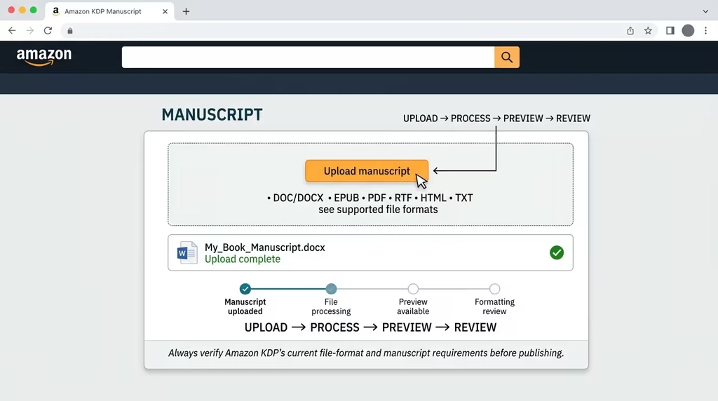
Amazon Kindle (KDP): Upload either a Word (.docx) file or an ePub file directly to KDP. KDP’s Kindle Create tool can also help format your uploaded file for Kindle display.
Frequently Asked Questions
What is the best word processor for formatting a book? Microsoft Word is the most feature-complete tool for professional book formatting, particularly for print. It offers the best control over mirrored margins, section breaks, hyphenation, widow/orphan control, and PDF export. For authors on a budget or working collaboratively, Google Docs handles most book formatting needs capably, with the caveat that mirrored margins and some advanced print settings may require a final export to Word.
What font size should I use for book body text? The standard range for print book body text is 10pt to 12pt, depending on your chosen typeface. Smaller optical fonts like Garamond work well at 11pt or 11.5pt. Larger physical fonts like Palatino may read comfortably at 10.5pt. Always test a printed sample page before committing to a size for the full manuscript.
How do I get different headers for each chapter in Google Docs? Insert a Section Break (next page) at the end of every chapter. In the new chapter’s section, double-click the header, and uncheck “Link to previous.” Then type the new chapter title. Repeat this unlinking process for every chapter’s odd-page header.
Should my chapter titles start on the right-hand (odd) page? In professional book publishing, yes. Major sections, including chapters, traditionally begin on recto (odd-numbered, right-hand) pages. Use an odd-page section break to enforce this automatically. If using Next Page section breaks, verify manually that chapters are landing on odd pages.
What is a blind folio? A blind folio is a page that is counted in the book’s pagination sequence but displays no page number. Blank pages and some front matter pages (such as the title page and copyright page) are common blind folios. The page still occupies a position in the sequence; it just displays nothing.
How do I prevent page numbers from showing on blank pages? The cleanest method is to use odd-page section breaks rather than manually inserting blank pages. The word processor generates the implied blank page internally without applying a visible header or footer to it. If you must manually insert a blank page, place it in its own section, unlink its header and footer, and clear all content from those areas.
Does formatting matter for ebooks as much as for print? The specifics of typography (leading, kerning, hyphenation, mirrored margins) matter far less in ebooks because readers can override many of these settings on their device. What matters for ebooks is heading styles (for chapter navigation), image quality, clean paragraph structure, and a readable default font and size. A well-styled Word document converts to a clean ebook more reliably than a manually formatted one.
What is the correct way to handle the Table of Contents in Google Docs? Use Insert > Table of Contents to auto-generate the TOC from your heading styles. Ensure every chapter title has a Heading 1 style applied, and every section heading uses Heading 2. Update the TOC after making all final edits by clicking inside it and pressing the refresh/update icon. This ensures page numbers are accurate.
Can I use WPS Docs to format a book for Amazon KDP? Yes. WPS Docs produces .docx files fully compatible with Amazon KDP’s upload requirements. Ensure your styles, section breaks, and page layout are set correctly before exporting. For the most reliable print output, save as .docx and upload directly to KDP, or export to PDF with fonts embedded.
How should I handle hyphenation in a justified book layout? Enable automatic hyphenation (Layout > Hyphenation > Automatic in Word). Set consecutive hyphen limits to 2 or 3 lines. This reduces the visual “rivers” of white space that appear in justified text without hyphenation. Do not apply hyphenation to headings or chapter titles.
What is the correct margin for a print book binding? The inside (gutter) margin should be wider than the outside margin to account for the binding. For books up to 150 pages, 0.75 inch is typically sufficient. For books from 150 to 400 pages, 0.875 inch to 1 inch is recommended. For books over 400 pages, consult your printer’s specific gutter requirements. Amazon KDP publishes a table of gutter requirements based on page count.
How do I ensure my page numbers are correct after adding sections? After each section break, double-click the footer in the new section. Check that “Continue from previous section” is selected in the Page Number Format options. If you are starting a new numbering sequence (such as switching from Roman numerals to Arabic at Chapter 1), set “Start at: 1” in the page number format dialogue for that section.
Your Manuscript Deserves a Presentation That Matches Its Value
Formatting is the final act of authorship. It is where your words receive the visual structure that makes them accessible, credible, and enjoyable for every reader who picks up your book.
The steps in this guide cover everything from the foundational page setup and trim size selection through to the precise management of running headers, chapter drops, hyphenation, and blank folios. Whether you are working in Google Docs, Microsoft Word, or WPS Docs, these are the settings and systems that produce a professionally polished result.
The key principles to carry forward:
- Set up your document structure (trim size, margins, styles) before formatting content
- Use section breaks for every structural transition; never rely on manual spacing
- Define and apply styles consistently across all headings and body text
- Unlink headers at the start of every chapter section for accurate alternating headers
- Use Odd Page section breaks to handle blank folios cleanly
- Review the final layout as a reader would: page by page, noting inconsistencies before export
Your book represents months or years of effort. The formatting is what carries that effort into the reader’s hands. Get it right, and your book stands confidently alongside any professionally published title.
If you want expert guidance on formatting your manuscript, structuring your content, or preparing your book for self-publishing, book a Transformation Clarity Call (TCC) with a DSE Consultant today. You will leave with clarity, a plan, and the confidence to publish like a professional.